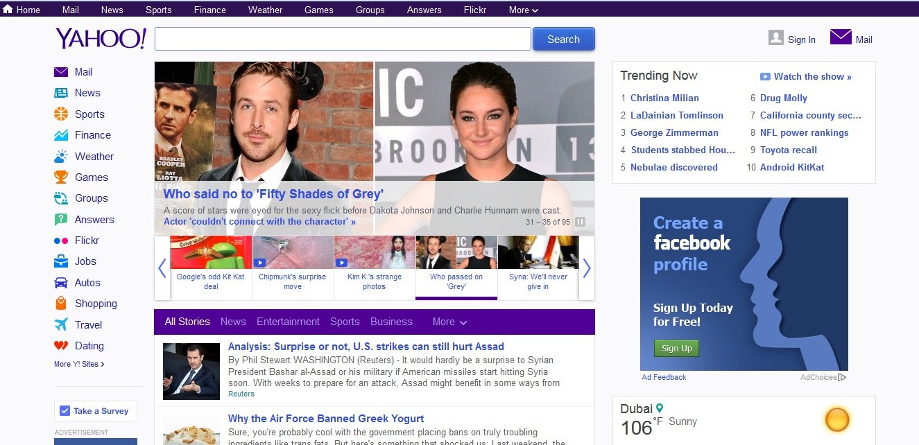
Following the footsteps of most large companies, Yahoo has released a newly redesigned logo that gives a more modern feel.
Announced yesterday, on Yahoo’s Tumblr blog, the redesign is said to be part of a 30-day effort by the tech giant to unveil a number of logo options the company considered before choosing one of the more simple formats to replace the 18 year-old design.
“Our brand, as represented by the logo, has been valued at as much as ~$10 billion dollars. So, while it was time for a change, it’s not something we could do lightly,” the blog post said. “We wanted a logo that stayed true to our roots (whimsical, purple, with an exclamation point) yet embraced the evolution of our products.”
This type of streamlining and simple format is not uncommon, as you can see by the evolution of airline logos. The redesign follows the Sunnyvale, Calif.-based firm’s sprucing up of a number of services, including Yahoo’s front page, email and the Flickr photo-sharing service, although the latter has been met with criticism by disgruntled users. Flickr fans were left raging after Yahoo introduced a menu showing links to assorted company properties, angering those who’d rather see photos and argued the change took up valuable “real estate.” However, Yahoo said the change ensures a “wider audience” sees Flickr.
The logo change is the latest in a number of changes Yahoo has made to try and regain momentum with Internet users. The firm has acquired many startups this year — including e-commerce company Lexity and AdMovate as Yahoo begins to shift its focus to the mobile space.
Yahoo CEO Marissa Mayer has repeatedly emphasized her interest in mobile, and declared during a recent webcast that “Yahoo’s future is mobile, and we’re delivering our products mobile first.”


